Table of Contents
Introduction
In this post I look into the document by Nassim Taleb: IQ is largely a pseudoscientific swindle. Most of the document is just a rant, but he does make some quantitative claims, which is good. I investigate the veracity of these claims using real data.
[Edit: The quotes below were taken verbatim from Taleb’s document as it was written when this post was uploaded.]
Variance explained by IQ
Claim:
[IQ] explains at best between 2 and 13% of the performance in some tasks
I already have prepared the WLS data set here, and it has a good IQ test, so I will use that. Lets look at the regression of grades on IQ.
imports
library(pacman)

p_load(tidyverse, magrittr, janitor, feather, MASS)

source('../../src/extra.R', echo = F, encoding="utf-8")

set.seed(1)
regression
wls <- read_feather("data/wls.f") %>%
  filter(rtype == "g") %>%
  mutate(grades_std = scale(grades))

summary(lm(grades_std ~ iq_std, wls %>% drop_na(iq_std, grades)))
| Estimate | Std. Error | t value | Pr(>|t|) | |
|---|---|---|---|---|
| (Intercept) | -0.0053 | 0.00818 | -0.648 | 0.517 |
| iq_std | 0.595 | 0.00816 | 73 | 0 |
| Observations | Residual Std. Error | \(R^2\) | Adjusted \(R^2\) |
|---|---|---|---|
| 9624 | 0.802 | 0.356 | 0.356 |
The adjusted R2 is 0.356, so IQ explains ~35% of the variance of grades in this data set. Taleb defenders may say that things such as school grades don’t matter in real life. But whatever your position on this, the situation is that he made a specific claim about how much IQ explains at best, which was off by a large factor.
IQ selection vs random selection
Claim:
Turns out IQ beats random selection in the best of applications by less than 6%
He hasn’t specified what exactly he means by this. But I’m pretty sure he is thinking of a comparison like the one he talks about in this tweet:

So I will analyze something this, a stylized example with assumptions similar to these. In the real world, you will likely have other information that complicates this picture, such as education credentials; but we ignore that for now.
I create two normally distributed variables, with correlation 0.5, and call them IQ and performance.
create variables
n <- 10**8

X0 <- MASS::mvrnorm(
  n=n,
  mu = c(0,0),
  Sigma = matrix(c(1,0.5,0.5,1),
                 2,2))

df <- tibble(IQ = X0[,1],
             performance = X0[,2])

df %>% summarise(
  cor = cor(IQ, performance),
  n = n(),
  mean_IQ = mean(IQ),
  sd_IQ = sd(IQ),
  mean_performance = mean(performance),
  sd_performance = sd(performance)
  )
| cor | n | mean_IQ | sd_IQ | mean_performance | sd_performance |
|---|---|---|---|---|---|
| 0.5 | 1e+08 | 3.16e-06 | 1 | 0.000102 | 1 |
The probability of hiring an employee with above average performance, if you hire an employee with above average IQ is:
above_average_iq <- df %>% filter(IQ > 0)

nrow(above_average_iq %>% filter(performance > 0)) / nrow(above_average_iq)
0.667
The probability if there was 0 correlation is of course 0.5. So using IQ as a criteria beats random selection by 16.67% (as Taleb also found). This is a little more than 6%, but that is a detail. More importantly, this example is a theoretical use case where using IQ testing is not so useful. To look at something a little more realistic, let’s say a company wants to avoid people with a performance more than 2 standard deviations below the mean. (Perhaps such employees have a risk of causing large harm, which could for instance be an issue in the military.) And we again compare admitting people at random vs only taking applicants with above average IQ.
If the company admits people at random, we get this proportion of people with a performance more than 2 SD below the mean:
bad_performance_w_random_selection <-
  nrow(filter(df, performance < -2)) / n

bad_performance_w_random_selection
0.0228
And if the company only takes applicants with above average IQ, we get this proportion of people with a performance more than 2 SD below the mean:
bad_performance_w_iq_criteria <-
  nrow(filter(above_average_iq, performance < -2)) /
  nrow(above_average_iq)

bad_performance_w_iq_criteria
0.00406
This is an improvement by a factor of:
bad_performance_w_random_selection / bad_performance_w_iq_criteria
5.6
In other words, using IQ selection criteria in this case beats random selection by more than 450%. Quite different than the claimed 6%.
IQ and income
Claim:
There is no correlation IQ/Income above 45K
He makes this claim based on this image:
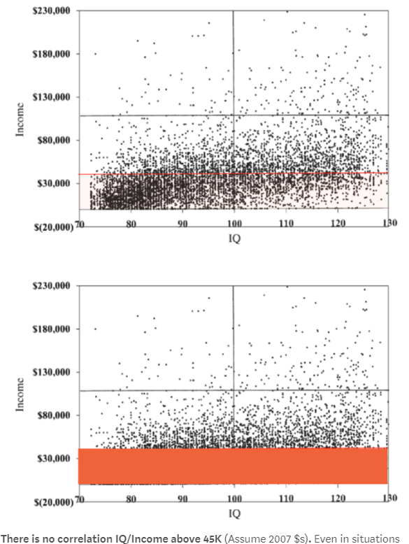
The image is from this paper, which gets its data from NLSY79. This data is also public, so we can again check for ourselves. Description of the preprocessing I perform is described here.
read nlsy
nlsy <- read_feather("data/nlsy79.f")

nlsy %>% select(iq, income) %>% drop_na() %>% count()
| n |
|---|
| 8232 |
The plot looks similar to the one from the paper, but somewhat different, because I use the average income values for a period of 10 years, instead of that from a single year.
plot
sc <- scale_y_continuous(
    breaks = c(100000, 200000, 300000, 400000, 500000),
    labels = c("$100,000", "$200,000", "$300,000", "$400,000", "$500,000")
  )

nlsy %>% ggplot(aes(x = iq, y = income)) +
  geom_point(alpha = 1, size = 0.5) + sc
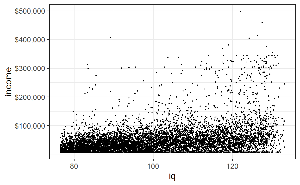
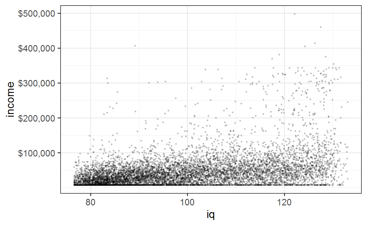
As in the plot used by Taleb it’s quite hard to see whats going on with all the overlying points. Reducing the transparency helps somewhat.
plot with reduced transparency
nlsy %>% ggplot(aes(x = iq, y = income)) +
  geom_point(alpha = 0.2, size = 0.5) + sc
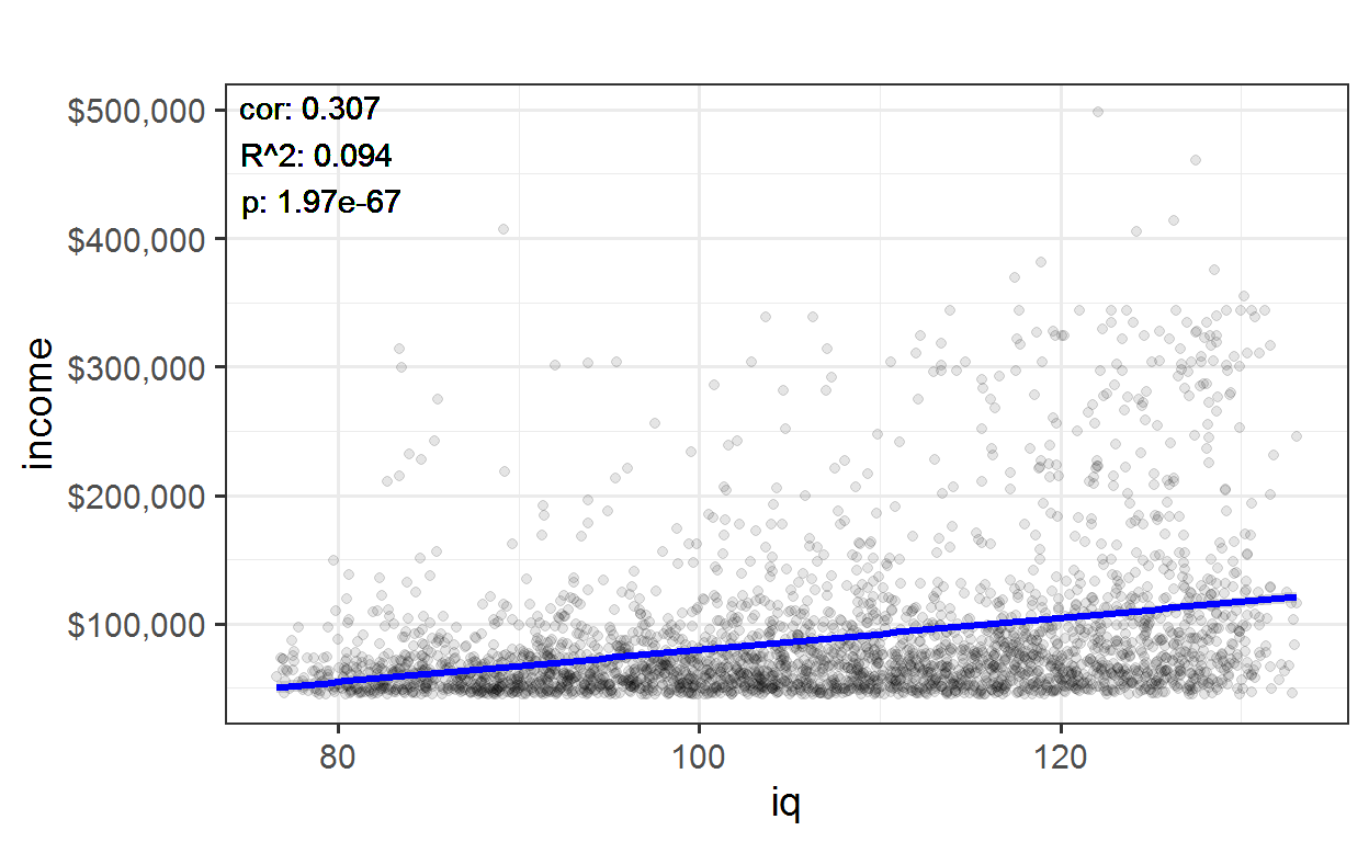
If we look at only incomes above $45.000 per year, there is still a clear correlation of about 0.3.
plot
nlsy %>% filter(income > 45000) %>%
  plot_lm("iq", "income") + sc
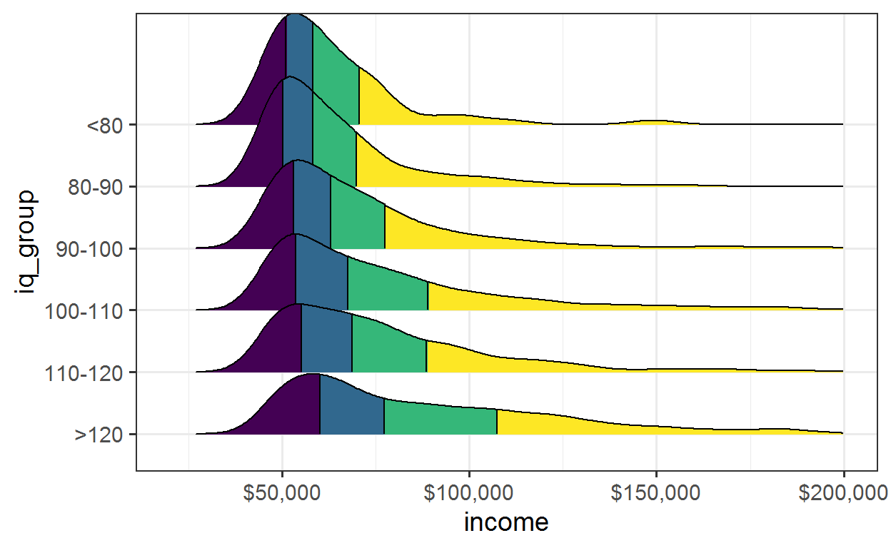
Another way to make the relationship clearer is to plot the distribution of income for seperate IQ groups. Plotting the distribution avoids the issue of the plot becoming unclear and confusing due to overlapping points.
The plot below again plots only people with income above $45k per year. The difference IQ makes is clear, both in the median value, and the length of the tails.
plot
nlsy_g <- nlsy %>% drop_na(income, iq) %>%
  mutate(
  iq_group = factor(case_when(
    iq <= 80 ~ "<80",
    between(iq, 80, 90) ~ "80-90",
    between(iq, 90, 100) ~ "90-100",
    between(iq, 100, 110) ~ "100-110",
    between(iq, 110, 120) ~ "110-120",
    iq >= 120 ~ ">120"),
    levels = c(">120", "110-120", "100-110", "90-100", "80-90", "<80"))
  )

nlsy_g %>% filter(income > 45000) %>%
  plot_ridges_q("income", "iq_group") +
  scale_x_continuous(
    limits = c(20000, 200000),
    breaks = c(50000, 100000, 150000, 200000),
    labels = c("$50,000", "$100,000", "$150,000", "$200,000"))
IQ and fat tails
[The income data] truncates the big upside, so we not even seeing the effect of fat tails
It is correct that in the presence of fat tails the correlation is uninformational in predicting expected income. And the data from these studies does not give good information about such tails. However, it is highly possible that the effect of IQ is even more impactful in the tails, rather than less. For example, Bill Gates and Paul Allen scores 1590/1600 on their SATs, which for SATs at that time meant extremely high IQs. Since Bill Gates is also in the tail of wealth and income, this indicates that the overall impact of people in the tails is to accentuate rather than diminish the importance of IQ.
Correlation only for low IQ
IQ mostly measures extreme unintelligence
He claims that IQ has high correlation with traits at low IQ, but that this correlation falls drastically at above median IQ, as illustrated in this figure from the post:
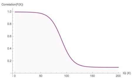
(Edit: In case this is not clear, Taleb uses the above figure as an illustration, not as a precise empirical claim.) It’s quite easy to look into the data to see whether this actually is the case. We can use the same two data sets used above.
If we plot IQ vs log(income), that will tell us how large a percentage increase in income each extra IQ point gives. Then we can plot a local regression (loess) and compare that to a linear regression. If the relationship between IQ and income radically diminished at above average IQ, then we would expect the loess regression line to approach horizontal. However, this is not what we see - instead the two regression lines follow each other quite closely. It is true that the percentage increase in income per IQ point is a little higher for lower IQs, but it never stagnates.
plot
nlsy %>%
  ggplot(aes(x = iq, y = income)) +
  geom_point(alpha = 0.2, size = 0.8) +
  stat_smooth(aes(color = "blue"), method = "loess") +
  stat_smooth(aes(color = "turquoise4"), method = "lm") +
  scale_color_discrete(
    name = "Regression type",
    labels = c("Loess", "Linear")) +
  scale_y_continuous(
    trans = "log10",
    breaks = c(10000, 30000, 100000, 300000),
    labels = c("$10,000", "$30,000", "$100,000", "$300,000")) +
  coord_trans(y="log10")
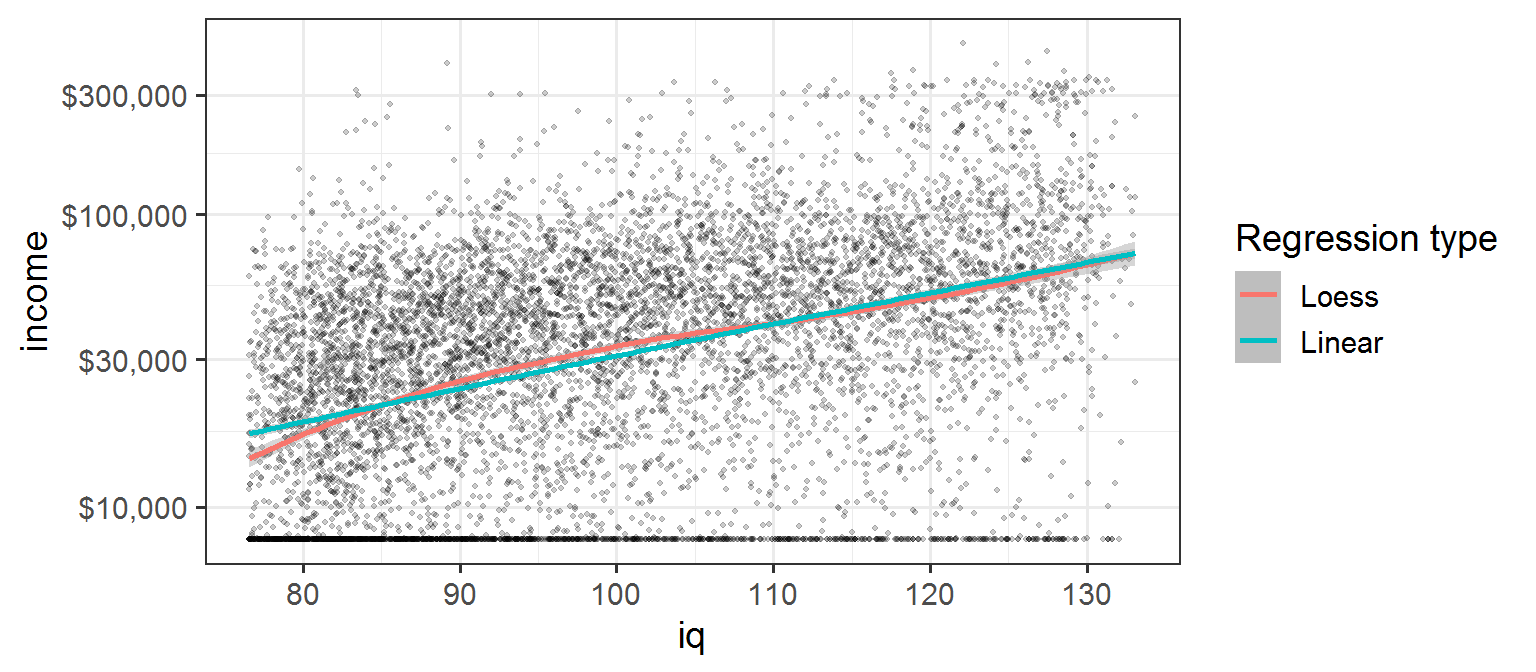
The regression results show that each IQ point increases log(income) by about 0.025
regression
m1 <- lm(log_income ~ iq, nlsy)

summary(m1)
| Estimate | Std. Error | t value | Pr(>|t|) | |
|---|---|---|---|---|
| (Intercept) | 7.8 | 0.0606 | 129 | 0 |
| iq | 0.0254 | 0.000603 | 42.1 | 0 |
| Observations | Residual Std. Error | \(R^2\) | Adjusted \(R^2\) |
|---|---|---|---|
| 8232 | 0.831 | 0.177 | 0.177 |
which means an increase in income of:
calculation
(exp(tidy(m1) %>% get("iq", "estimate")) -1) * 100
2.57
percent for each IQ point.
An alternative illustration is shown below, using the WLS grade-IQ relationship:
plot
plot_smooth <- function(df, above_median, color){
    stat_smooth(aes(color = color), data = df %>% filter(iq_above_median == above_median),
                method="lm", se=F, fill=NA, formula=y ~ x, size=1.2)
}

wls %<>% mutate(iq_above_median = iq100 > 100)

wls %>%
  ggplot(aes(y = grades, x = iq100)) +
  geom_jitter(alpha = 0.05) +
  plot_smooth(wls, F, "turquoise4") +
  plot_smooth(wls, T, "blue") +
  scale_color_discrete(
    name = "Relationship, IQ and grades",
    labels = c("Above median IQ", "Below median IQ")) +
  labs(x = "iq")
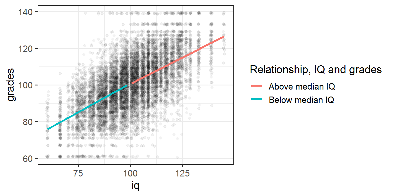
We see clearly that the above 100 IQ line has a slope that is not horizontal, meaning IQ correlates with grades even at higher than median IQ. In fact the slope is about the same as that for the regression line of students with below median IQ.
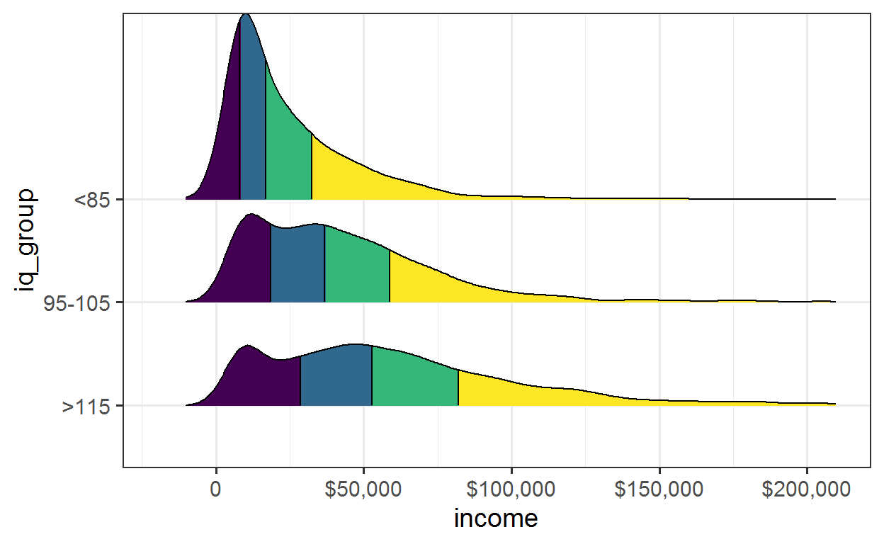
In a third illustration, we can look at the distributions of incomes for high, low and median IQs. Both increases in IQ moves the median of the income distribution and enlarges the tail.
plot
nlsy_g <- nlsy %>% drop_na(income, iq) %>%
  mutate(iq_group = factor(case_when(
    iq <= 85 ~ "<85",
    between(iq, 95, 105) ~ "95-105",
    iq > 115 ~ ">115"),
    levels = c(">115", "95-105", "<85"))
  ) %>%
    drop_na(iq_group)

nlsy_g %>%
  plot_ridges_q("income", "iq_group") +
  scale_x_continuous(
    limits = c(-20000, 210000),
    breaks = c(0, 50000, 100000, 150000, 200000),
    labels = c("0", "$50,000", "$100,000", "$150,000", "$200,000"))
Conclusion
All the claims from the article that I looked at, that can be interpreted as something specific and tested in a real data set, turned out not to be correct. If Taleb hadn’t blocked everyone who disagrees with him, perhaps he would have found out about this, and not published a post with all these incorrect claims.